
- IT (1169)

목록스터디/WEB (8)
오늘도 공부
Rust는 안전성과 성능을 중시하는 시스템 프로그래밍 언어로, 이를 기반으로 한 다양한 웹 프레임워크가 개발되고 있습니다. 주요 Rust 웹 프레임워크들의 장단점을 비교해 드리겠습니다.1. Actix-web장점:고성능: 비동기 I/O를 활용하여 높은 성능을 제공합니다.풍부한 기능: 다양한 내장 기능과 확장성을 갖추고 있습니다.활발한 커뮤니티: 꾸준한 업데이트와 지원이 이루어지고 있습니다.단점:복잡한 사용법: 초보자에게는 학습 곡선이 가파를 수 있습니다.안전성 우려: 과거에 일부 안전성 이슈가 제기된 바 있습니다.2. Rocket장점:간결한 문법: 매크로를 활용한 직관적인 라우팅을 제공합니다.동기식 모델: 동기식 요청 처리를 통해 코드의 가독성이 높습니다.안정성: 타입 안전성을 강조하여 컴파일 타임에 오류..
 Clipping CSS - Day3
.final__clip-image-1 { -webkit-clip-path: circle(50% at 50% 50%); clip-path: circle(50% at 50% 50%); } .final__clip-image-2 { -webkit-clip-path: polygon(0% 0%, 100% 0%, 100% 75%, 75% 75%, 75% 100%, 50% 75%, 0% 75%); clip-path: polygon(0% 0%, 100% 0%, 100% 75%, 75% 75%, 75% 100%, 50% 75%, 0% 75%); } .final__clip-image-3 { -webkit-clip-path: polygon(20% 0%, 0% 20%, 30% 50%, 0% 80%, 20% 100%, 50% 7..
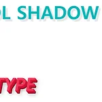 Sexy Typograping - Day2
.shadow-typo { position: relative; display: inline-block; font-size: 4em; text-transform: uppercase; color: #00b3b4; text-shadow: 3px 3px 0px #e7eef1, 8px 8px 0px rgba(0, 0, 0, 0.1); } .threedee-typo { font-size: 4em; text-transform: uppercase; color: #f2395a; -webkit-transform: skew(-5deg, -5deg) rotate(5deg); transform: skew(-5deg, -5deg) rotate(5deg); -webkit-transform-origin: center center; ..
CSS Next grid 클론 ( 1 ~ 5 )부산에서 매주 진행되는 CSS 초중급 스터디입니다.더 많은 스터디는 네이버 카페에서 확인 부탁드립니다.이 내용은 니콜라스님의 CSS 마스터 클래스를 공부하고 정리한 글입니다.이번주는 1 ~ 5번 페이지까지 공부했습니다. Github 소스12345
 PostCSS 스터디 정리 ( 2주차 )
PostCSS 공부 ( 부산 스터디 2주차 ) 정리부산에서 매주 진행되는 CSS 초중급 스터디입니다.더 많은 스터디는 네이버 카페에서 확인 부탁드립니다. 이 내용은 니콜라스님의 CSS 마스터 클래스를 공부하고 정리한 글입니다. Github 소스링크저번 시간에는 CSS Next 에 대해서 정리를 했었다. 1주차 정리 바로가기 FlexCSS Next이번 스터디는 PostCSS 에 대해서 공부 하도록 한다. 공부할 내용은 아래와 같다. ParcelPostCSS & Parcelpseudo classCss Variables@custom media and media query rangescolor-mod, gray(), System-uiNesting Rules기타 추천 사이트들Parcel코드를 압축,변환등을 해주는..
Web 디자인시 유의 할 점 정리이 내용은 유데미 강좌를 보고 정리한 글입니다. 웹에 필요한 리소스들을 정리해둔 사이트 http://codingheroes.io/resources/요약대부분의 콘텐츠는 텍스트이므로 멋진 타이포그래피는 멋진 웹 사이트의 핵심 요소입니다.이미지는 웹 디자인에서 점점 더 중요 해지고 있습니다. 따라서 훌륭한 이미지를 선택하고 그 위에 텍스트를 넣는 것이 작업의 필수적인 부분입니다.아이콘은 웹 사이트의 친숙한 음색을 설정하는 좋은 방법이지만 신중하게 사용하십시오.공백을 적절하게 사용하면 전문적으로 디자인 된 웹 사이트가 만들어 지므로 올바른 방법으로 많이 사용하십시오.콘텐츠의 시각적 계층 구조를 정의하여 레이아웃을 작성하십시오. 공백은 또한 이것을 위해 중요합니다.웹 사이트는 사..
 CSS Next 정리 ( 부산 1주차 HTML + CSS 스터디 )
HTML + CSS 스터디 1주차 스터디 정리내용 #2부산에서 매주 진행되는 CSS 초중급 스터디입니다.더 많은 스터디는 네이버 카페에서 확인 부탁드립니다.저번 시간은 Flex 에 대해서 공부했다.Flex로 화면 배치 하는데 불편함이 다소 있다. 그래서 Css Grid 라는 게 나왔다.CSS Grid 에 대해서 하나씩 정리해보도록 하겠다.이 내용은 니콜라스님의 CSS 마스터 클래스를 공부하고 정리한 글이다. CSS Grid 가 필요한 이유?우선 FlexBox 가 부족한 부분이 뭔지 살펴보자.만약 여러개의 박스가 들어올 경우 overflow 되면서 배치가 되기 때문에 보기가 안좋을 수 있다.CSS Grid System 이라고 하는 테이블같은 걸 쉽게 짤 수 있도록 도와준다.CSS Grid BasicGrid..
 Flex Css 스터디 정리
HTML + CSS 스터디 1주차 스터디 정리내용부산에서 매주 진행되는 CSS 초중급 스터디입니다. 목차FlexFlex BasicMain Axis and Cross AxisFlex Wrap and Directionwrapflex-directionAlign selfFlexFlex Basic컨테이너들을 가로 또는 세로로 정렬을 쉽게 도와준다. . displayjustify-content Document body{ display: flex; justify-content: space-between; } .box { width: 300px; height: 300px; background-color: red; border: 1px solid white; } Main Axis and Cross AxisMain Axi..